As someone who routinely analyzes onboarding funnels across ecommerce, gaming, and fintech products, I’ve seen how “seamless registration” can lift conversions by double digits without compromising trust. This guide distills those lessons into concrete steps you can use today.
What “Seamless Registration” Really Means
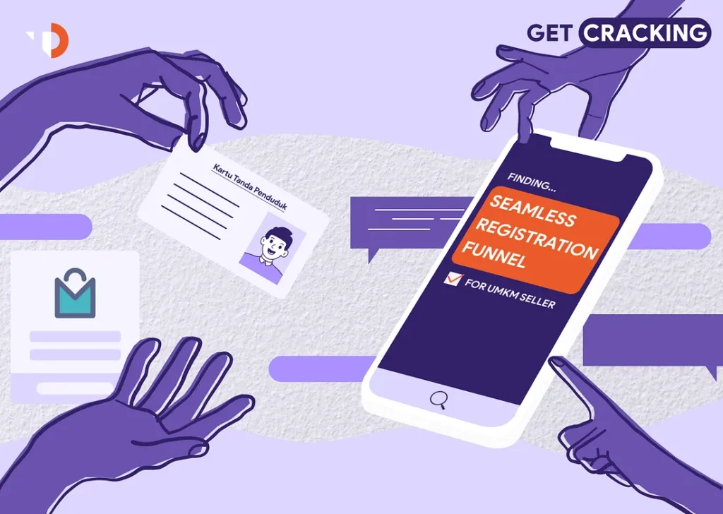
Seamless registration is a sign-up experience that feels natural, fast, and safe. It minimizes cognitive load, asks only what’s necessary, adapts to user context (device, region, intent), and resolves errors before they become frustrations.
Why Seamless Registration Matters
- Faster time-to-value → more completed sign-ups
- Lower abandonment at the first hurdle (the #1 drop-off point on most sites)
- Higher quality data (because inputs are validated and autofilled)
- Better security posture with invisible protections (bot checks, rate limits)
Core Principles of a Seamless Registration Flow
Ask for Less, Earn the Rest
Collect only what’s needed to create an account (usually email/phone + password or a passwordless method). Progressive profiling can gather extras after first use.
Remove “Speed Bumps”
- Autofill names, emails, and addresses using the browser and OS capabilities.
- Auto-format phone numbers and BIN-based card brand hints (if relevant).
- Inline validation: show issues as the user types—no post-submit error walls.
Offer Familiar, Low-Friction Entry Points
- Social sign-in options (Apple, Google) for speed—plus email/phone for users who prefer not to link social accounts.
- Passwordless options (magic link or one-time code) for mobile-first audiences.
Secure Without Making Users Work
Keep security “quiet”: background bot detection, device fingerprinting, rate-limiting, and subtle step-up checks when risk spikes (e.g., unusual device or location).
UX Patterns That Consistently Improve “Seamless Registration”
Seamless Registration with Progressive Disclosure
Start with a single field (“Enter email to continue”). After submit, reveal the next step (magic link, code, or password). This reduces intimidation and keeps momentum.
Contextual Hints and Micro-copy
- “We’ll never share your email. Used for receipts & security alerts.”
- Show password rules inline and mark each rule as it’s met.
- Replace vague errors (“Invalid input”) with precise guidance (“Use at least 8 characters and one number”).
One-Screen, One-Decision
On mobile, push everything into one scannable screen with:
- Top: benefit framing (“Create your account to save progress & get rewards”)
- Middle: primary field(s) + autofill
- Bottom: primary CTA (“Create account”) + secondary (“Continue as guest” if supported)
Smart Defaults & Device-Aware Inputs
- Numeric keyboard for OTPs and phone fields.
- Auto-detect country by IP for phone prefix; let users change it.
- Paste-to-OTP and auto-advance between code boxes.
Practical Examples by Vertical
Ecommerce
- Offer “Checkout as Guest” with a gentle nudge: “Create a password to save your order history (10s).”
- Address autocomplete reduces typos—and delivery failures.
Gaming
- “Play first, register later”: let new players start as guests; prompt account creation at a natural win state (e.g., first achievement).
- Passwordless via console or mobile device makes re-entry effortless.
Fintech
- Two-step model: quick account creation (email/phone) → guided KYC only when required for actions like withdrawals.
- Explain each identity step (“2–3 minutes, you’ll need a photo ID”) to reduce anxiety.
Engineering Checklist for Seamless Registration
- Pre-validate email domains (MX records) before sending magic links.
- Soft-rate-limit OTP attempts and lock by device + IP, not just account.
- WebAuthn/FIDO2 as an optional upgrade for instant, secure sign-ins.
- Graceful retries for OTP/magic links; allow “Resend” with a visible timer.
- Analytics events at each step (view, input started, error, submit, success).
Two Original Tips You Won’t Find in Generic Guides
1) “Two-Tap Rescue” for Magic Links
If a magic link is opened on a different device than where it was requested (common on mobile/desktop crossover), show a QR code and a 6-digit short code on the landing page. The user can either scan or manually enter that short code on the original device to complete sign-in—no email juggling.
2) “Intent-Tagged Registration”
Add a single, optional dropdown during sign-up: “What brings you here today?” (e.g., “Track orders,” “Play multiplayer,” “Start free course”). Use this to personalize the first session (surface the exact feature they want) and defer everything else. This reduces time-to-value and lowers immediate churn.
Copy Examples You Can Borrow
- Benefit header: “Create your account in under a minute—secure, no spam.”
- Micro-promise: “We’ll only email you about security and receipts.”
- Gentle step-up: “Unusual sign-in detected—quick verification to keep your account safe.”
Common Pitfalls (and Fixes)
- Forcing account creation before any value → Allow guest mode or preview.
- Over-collecting data → Move to post-registration profile steps.
- Harsh error states → Use inline, friendly guidance and preserve user input.
- OTP fatigue → Offer alternate paths (magic link, authenticator app) after one failed attempt.
Measuring “Seamless”
Track both speed and satisfaction, not just completion rate. Benchmarks to monitor:
- Completion rate of first step vs. entire flow
- Median time to first value (TTFV)
- % OTP or magic-link failures (by device + ISP)
- Error-per-user and “rage clicks” on mobile
A/B Tests That Pay Off
- Passwordless vs. password (by segment, e.g., mobile-only)
- “Play first/Checkout first” guest flows vs. forced registration
- Inline password rules vs. post-submit errors
- One-screen vs. multi-step wizard on mobile
Compliance & Trust, Seamlessly
Keep your privacy notice one click away and human-readable. If you’re in regulated markets, summarize why a document is needed (“We verify identity to keep your money safe”) and show a progress indicator with time estimates.
Quick Start Blueprint (Copy/Paste Roadmap)
- Start with email/phone only + passwordless fallback
- Add autofill, inline validation, and OTP auto-capture
- Implement guest mode or “continue later” where possible
- Layer invisible security + gentle step-up checks
- Instrument analytics at every step and iterate weekly
Conclusion
Seamless registration isn’t about clever UI tricks—it’s about respecting a user’s time and intent. Start small, remove friction where it hurts most, and let security work quietly in the background. Do this well, and sign-ups will climb without sacrificing trust.
You might also like: